
Getting started
Install
Install the core and the renderer for your framework:
npm install @andamento/core @andamento/reactnpm install @andamento/core @andamento/vuenpm install @andamento/core @andamento/domnpm install @andamento/core @andamento/svgThe packages are ES modules with CommonJS builds and TypeScript types. The core has no dependencies.
A first layout
Every layout needs a region (the area to tile, in any unit you like) and a tiling (the pattern). The core's helper functions (hexagonal, herringbone, grid, …) build tiling specs, which are plain JSON objects.
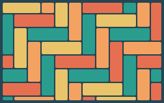
import { createLayout, herringbone } from "@andamento/core";
import { renderToString } from "@andamento/svg";

export default function quickstart() {
  const layout = createLayout({
    region: { x: 0, y: 0, width: 240, height: 150 },
    tiling: herringbone({ length: 60, width: 20 }),
    gap: 2,
    margin: 4,
    cornerRadius: 2,
  });
  return renderToString(layout, {
    fill: ["#e9c46a", "#f4a261", "#e76f51", "#2a9d8f"],
    background: "#264653",
  });
}
renderToString returns an <svg> string with a viewBox, so it scales to whatever size you give it.
Photos in React
<TileLayout> puts each child in a tile, in reading order (top to bottom, then left to right). Children are clipped to the tile shapes; coverStyle makes an image or video fill its tile like CSS object-fit: cover.
import { TileLayout, coverStyle } from "@andamento/react";
import { hexagonal } from "@andamento/core";

export function PhotoWall({ photos }: { photos: { src: string; alt: string }[] }) {
  return (
    <TileLayout
      options={{ region: { x: 0, y: 0, width: 240, height: 150 }, tiling: hexagonal({ size: 26 }), gap: 2 }}
      background="#f4f1ea"
      aria-label="Photos"
    >
      {photos.map((p) => <img key={p.src} src={p.src} alt={p.alt} style={coverStyle} />)}
    </TileLayout>
  );
}
The region's units only set the shape and the proportions. The layout fills the width of its container, and its height follows from the region's aspect ratio.
Photos in Vue
<script setup lang="ts">
import { TileLayout, coverStyle } from "@andamento/vue";
import { hexagonal } from "@andamento/core";

defineProps<{ photos: { src: string; alt: string }[] }>();
const options = { region: { x: 0, y: 0, width: 240, height: 150 }, tiling: hexagonal({ size: 26 }), gap: 2 };
</script>

<template>
  <TileLayout :options="options" background="#f4f1ea" aria-label="Photos">
    <img v-for="p in photos" :key="p.src" :src="p.src" :alt="p.alt" :style="coverStyle" />
  </TileLayout>
</template>
Photos anywhere else
The <andamento-layout> web component works in plain HTML and in any framework:
<script type="module">
  import { defineTileLayoutElement } from "@andamento/dom";
  defineTileLayoutElement();
</script>

<andamento-layout
  options='{"region":{"x":0,"y":0,"width":240,"height":150},"tiling":{"type":"hexagonal","size":26},"gap":2}'
  background="#f4f1ea" label="Photos">
  <img src="beach.jpg" alt="Beach" />
  <img src="hills.jpg" alt="Hills" />
</andamento-layout>
Try it live
The playground has every pattern and option, rendered by React, Vue, the web component and SVG side by side.
Next
- Layouts and cells explains what
createLayoutreturns. - Patterns shows every tiling.
- Placing content covers what goes in which tile.