
Featured tiles and weights
Featured tiles
A feature merges several neighboring tiles into one bigger cell, for a hero image or a highlighted item.
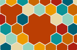
/** Featured tiles: a flower of 7 hexagons in the middle, and 3 more near the top left. */
export function features() {
  const layout = createLayout({
    region: { x: 0, y: 0, width: 260, height: 170 },
    tiling: hexagonal({ size: 22 }),
    gap: 2.5,
    cornerRadius: 3,
    features: [{ tiles: 7 }, { tiles: 3, at: { x: 50, y: 40 } }],
  });
  return renderToString(layout, { images: photos(60), background: "#e9e3d8" });
}
How the tiles are chosen:
- Starting point: the group grows from a tile near
at, which defaults to the middle of the region. - Growth: it adds whichever neighbor keeps it most compact, so 4 grid tiles make a 2 × 2 square and 7 hexagons a flower.
- Trying several starts: it tries growing from several of the free tiles nearest
atand keeps the most compact group, close toat, avoiding tiles the region's edge cuts. A tile the margin only trims counts as whole. - No sharing: features never share tiles. A later feature grows among the tiles still free, and gets fewer tiles if it runs out of room.
- Choosing the tiles yourself: pass
idsinstead. Tile ids are stable, so read them from a layout without features.
Merging happens before the gap and edge handling, so a featured cell has the same gap all round and is cut, rounded and given neighbors like any other. Featured cells have featured (their position in features) and merged (the ids of the tiles inside them).
Content: featured cells take content first, so the first child goes in the first feature, and so on; the rest follow placement as usual. A feature can name its item instead: { tiles: 4, item: 6 } holds the seventh item.
Feature field | |
|---|---|
tiles | How many tiles to merge. Defaults to 4. |
at | Where the group starts, in region units. Defaults to the region's middle. |
ids | Exact tile ids to merge instead (overrides tiles and at). |
item | Which content item goes in this cell. |
Important items
When some items matter more than others, give each a weight: the number of tiles it spans.
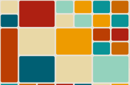
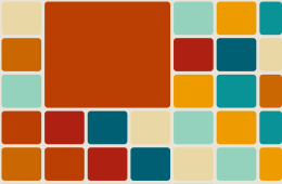
/** Important items: every fifth photo spans 4 tiles, placed where it falls in the order. */
export function weights() {
  const items = photos(32);
  const weights = items.map((_, i) => (i % 5 === 0 ? 4 : 1));
  const { layout } = weightedLayout(
    { region: { x: 0, y: 0, width: 260, height: 170 }, tiling: grid({ width: 40, height: 30 }), gap: 3, cornerRadius: 3 },
    weights,
    { fit: true },
  );
  return renderToString(layout, { images: items, background: "#e9e3d8" });
}- Featured tiles from weights: every item over 1 (weights are rounded) gets a featured tile that many tiles big.
- Where they go: each feature is centerd on the tiles its item would have filled, one by one, in reading order, so heavy items stay among their neighbors.
- Order: bigger features are placed first, so they get room.
- With
fit: the tiles are sized so everything fits, counting each item as its weight.
In the components it's one prop:
<TileLayout options={options} weights={[1, 4, 1, 1, 1, 9]} fit>
  {photos.map((src) => <img key={src} src={src} alt="" style={coverStyle} />)}
</TileLayout>- React, Vue,
mountTileLayout:weights. <andamento-layout>:data-weight="4"on children, or aweightsproperty.<SvgTileLayout>(React and Vue):imageWeights.- Needs
options: all of these needoptions, not a ready-madelayout, since the layout depends on the weights.
In core, weightedLayout(options, weights, { fit, cells, placement }) returns { options, layout, features }, and weightedFeatures(layout, weights) returns just the features for a layout made without them. contentSlots and matchSlots then put each item in its own featured cell.
When heavy items crowd together, a later feature may find no free block nearby and take an L or T shape instead. Bigger tiles or fewer heavy items keep them square.